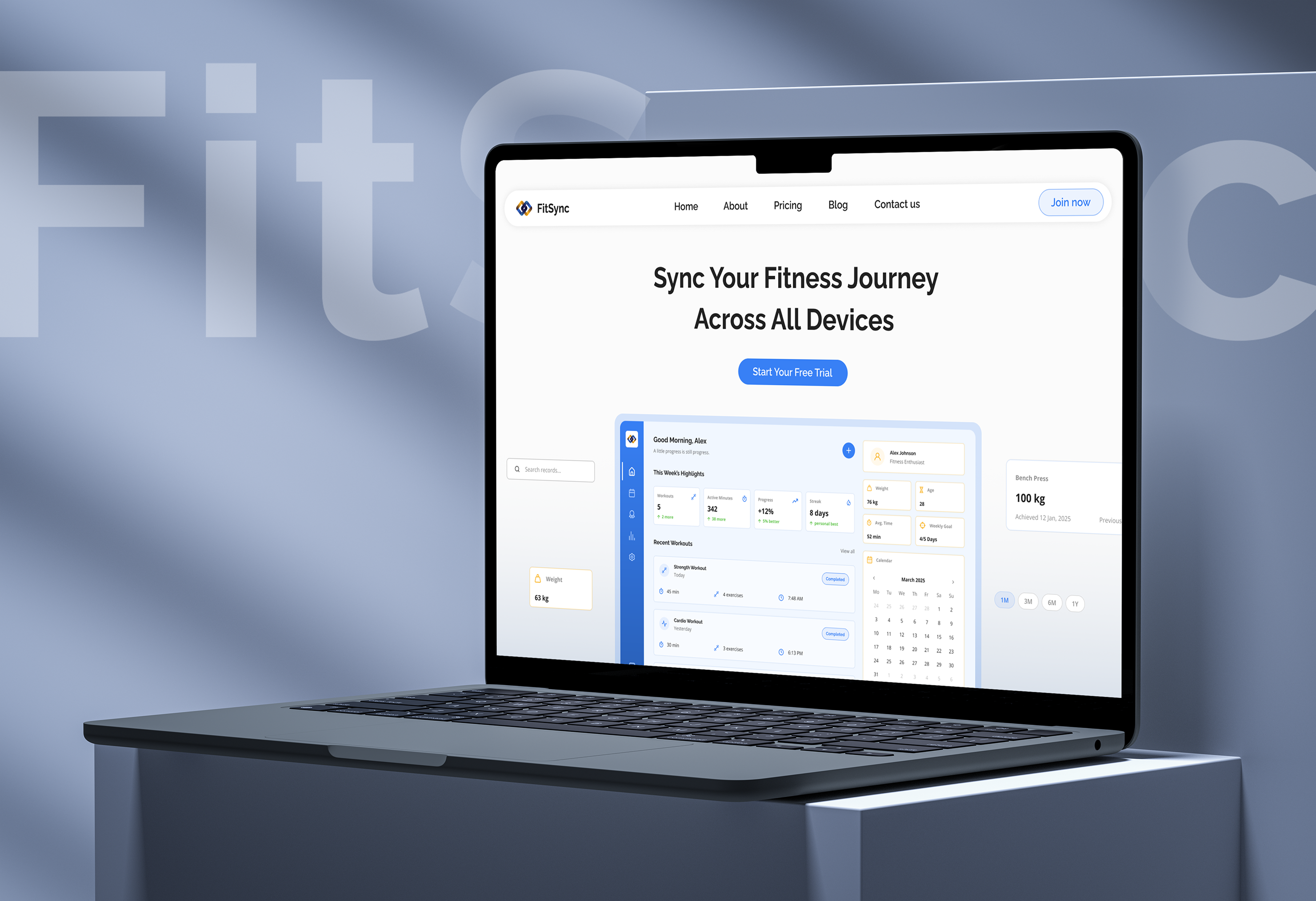
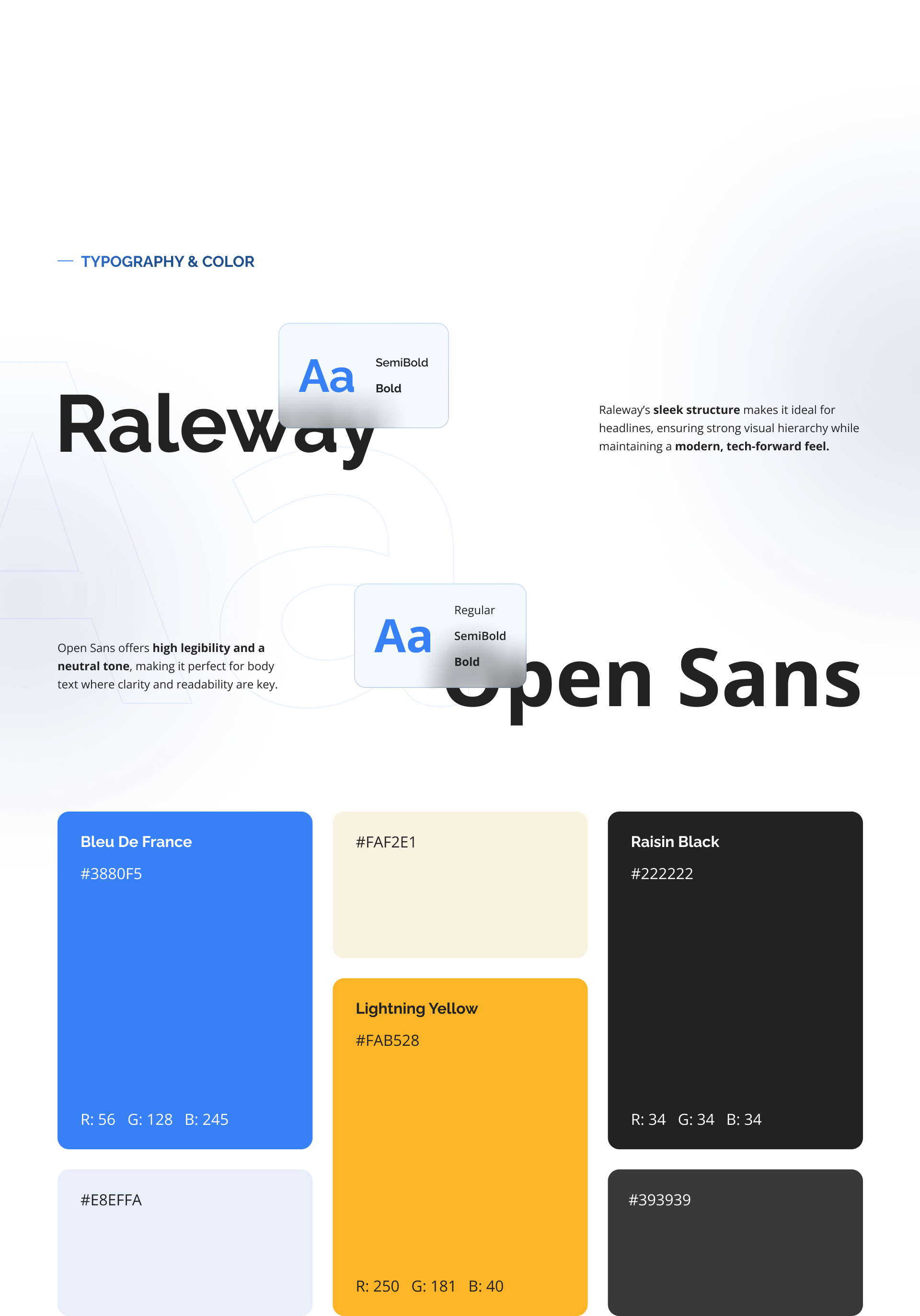
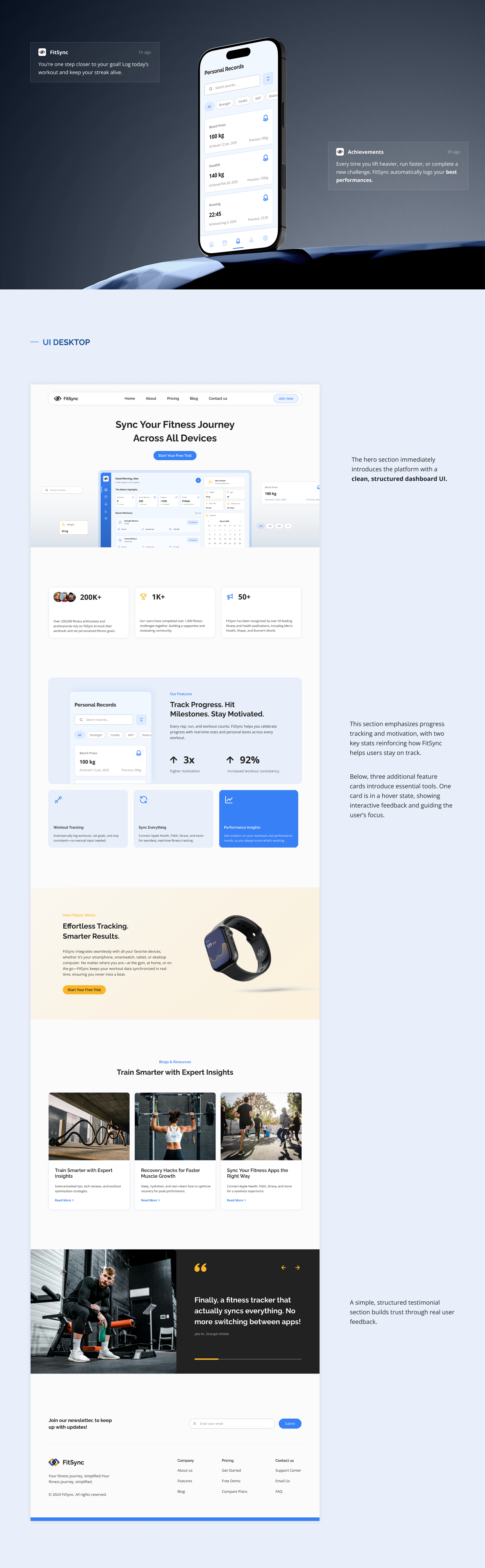
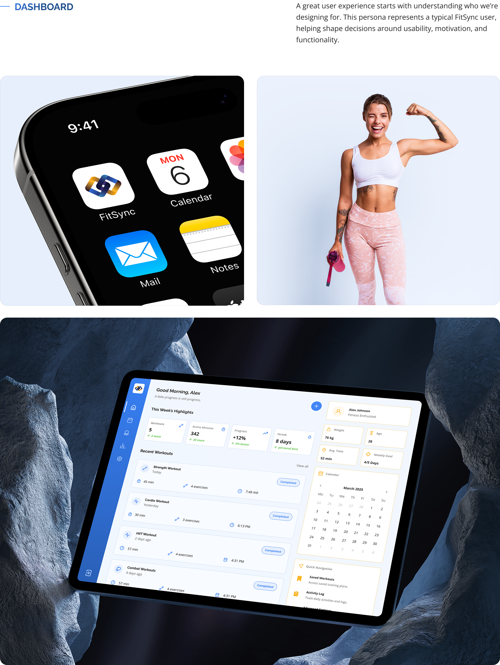
The product

A fitness platform. One dashboard across every device.

The challenge

Sell a data-heavy product without overwhelming the page.

Focus

Marketing site and visual system.

Year / Type

2026. Fitness platform.

The FitSync marketing site shown on a MacBook: the headline 'Sync Your Fitness Journey Across All Devices' above a dashboard preview.
FitSync design process: a six-step flow from user research, UX strategy, and wireframing to visual design, usability testing, and solution presentation. FitSync UI elements: pill buttons for Strength, Weight, Age, Avg. Time, Weekly Goal, Progress, Streak, Sync, and the FitSync logomark. FitSync user persona: Chris Reynolds, 21, a tech-savvy college student, with his goals, motivations, and pain points around tracking workouts.
FitSync typography and colour: Raleway and Open Sans, with the palette (Bleu De France, Lightning Yellow, Raisin Black, cream, periwinkle), shown on a dark mesh background.
FitSync UI desktop: the full marketing page from the dark hero through feature sections, testimonials, and footer. FitSync dashboard: the app icon on an iPhone home screen, a fitness model, and the dashboard shown on a tablet held over stone.
← All projects Next: Nimbus →